Last week, Rolling Stone released its list of "The 50 Worst Album Covers of All Time." It featured album covers by familiar names like Michael Jackson, Yeah Yeah Yeahs, Bob Dylan, and Kanye West. And the publication's top pick, Limp Bizkit's cover for 2000's Chocolate Starfish and the Hot Dog Flavored Water, is a solid choice.
Naturally, some Miami acts were called out, including the 2 Live Crew's iconic artwork for 1989's As Nasty as They Wanna Be, which came in at number 33. Considering how that album is so ingrained into South Florida's hip-hop history, it's a perplexing choice. The critique of the cover as "crass and hacky" feels like the writer is applying a contemporary viewpoint to something that came out during a much different time.
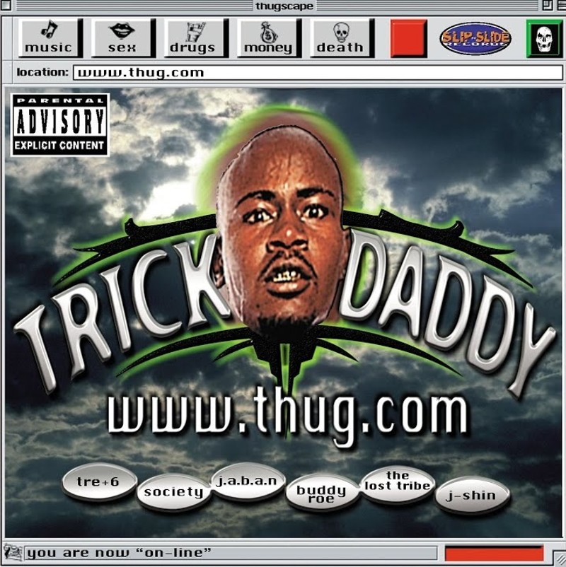
But the choice that interested me was number 13, Trick Daddy's artwork for his 1998 album, www.thug.com, which contains the breakthrough single "Nann," featuring Trina. The cover resembles a web browser called "thugscape" — an obvious reference to the then-popular Netscape — features a homepage screen with a fairly low-res image, even for late '90s standards, of Trick's floating head above buttons feature the names of several of the album's collaborators. The real kick is the "you are now 'on-line'" tag at the bottom.
The whole thing screams Y2K, a label that is often misused today. Named after the Y2K bug that promised to bring down the entire world on January 1, 2000, the Y2K design aesthetic started popping up in the latter half of the '90s, as the dawn of the new millennium approached. Designers were inspired and hopeful about the future, and their work showcases that through chrome accents, bright colors, and bloated typeface. Think Apple's iMac G3, Hype William-directed music videos, and the countless defunct GeoCities websites.
The design trend officially ended when Americans' optimism burst after 9/11 and the start of the war in Iraq, quickly replaced by the McBling aesthetic. Gen Z, who have little to no recollection of the period, often erroneously call many of McBling's signature tropes "Y2K," but they are not. What's McBling? It's peak Paris Hilton: Juicy Couture tracksuits, Von Dutch trucker hats, anything Baby Phat. It's a period when it felt like Americans were trying to numb the pain of endless wars and a much scarier world with as much bedazzled stuff as they could buy.
Trick's album cover is emblematic of the former, with the designer, Society Productions Inc., taking many cues from the established Y2K design language. That's not to say it's a great example of the style — it's lazy in many ways.
There's the unimaginative use of the Chicago typeface for most of the album cover's text. Designed by Susan Kare in 1984 for use on Macintosh computers, the font was Apple's typeface of choice for its operating system until Mac OS 8. (It remained on life support for a while on iPods.) While I understand the choice — Society was trying to re-create a computer screen, after all — the font was also used in the album's liner notes and feels akin to deploying Times New Roman as a design choice today.
The album's title, www.thug.com, too, dates the project to a time when online connectivity was still something to marvel at. Remember the excitement when your modem shrieked as it attempted to connect, and you heard "Welcome! You've got mail!" as you signed into AOL? That's what this album cover is giving.
Even then, the ultra-low-res image of Trick's floating head seems like overkill. (Even in the '90s, high-resolution imaging was a thing and certainly achievable with the era's hardware.)
Society Productions handled the artwork for many of Slip-N-Slide's releases as well as those of other Southern hip-hop acts during the period, including acts like the P.O.D., Suicide, Tre+6, and Gada. Little other information about Society can be found online. (At one point, Slip-N-Slide released music by conscious rapper Society, AKA Marcus Effinger, but I couldn't find anything that pointed to him doing graphic design as well.)
So www.thug.com's design feels like a product of its time. Is it ugly? Sure, but it tells the story of South Florida hip-hop and its evolution. Trick's sophomore album would go on to be certified gold by the Recording Industry Association of America and kicked off a string of successful albums and singles for the rapper, who saw his profile rise as Southern hip-hop dominated the early 2000s.
It's ugly, but it's our ugly.
Is this one of the ugliest album covers of all time? Rolling Stone thinks so.
Slip-N-Slide Records photo

Audio By Carbonatix
[
        {
          "name": "Air - MediumRectangle - Inline Content - Mobile Display Size",
          "component": "19274298",
          "insertPoint": "2",
          "requiredCountToDisplay": "2",

          "watchElement": ".fdn-content-body",
          "astAdList": [
            {
              "adType": "rectangle",
              "displayTargets": "mobile"
            }
          ]
        },{
          "name": "Editor Picks",
          "component": "17482312",
          "insertPoint": "4",
          "requiredCountToDisplay": "1",

          "watchElement": ".fdn-content-body",
          "astAdList": [
            {
              "adType": "rectangle",
              "displayTargets": "desktop|tablet"
            },{
              "adType": "rectangle",
              "displayTargets": "desktop|tablet|mobile"
            }
          ]
        },{
          "name": "Inline Links",
          "component": "18711090",
          "insertPoint": "8th",
          "startingPoint": 8,
          "requiredCountToDisplay": "7",
          "maxInsertions": 25
        },{
          "name": "Air - MediumRectangle - Combo - Inline Content",
          "component": "17482310",
          "insertPoint": "8th",
          "startingPoint": 8,
          "requiredCountToDisplay": "7",
          "maxInsertions": 25,

          "watchElement": ".fdn-content-body",
          "astAdList": [
            {
              "adType": "rectangle",
              "displayTargets": "desktop|tablet"
            },{
              "adType": "rectangle",
              "displayTargets": "desktop|tablet|mobile"
            }
          ]
        },{
          "name": "Inline Links",
          "component": "18711090",
          "insertPoint": "8th",
          "startingPoint": 12,
          "requiredCountToDisplay": "11",
          "maxInsertions": 25
        },{
          "name": "Air - Leaderboard Tower - Combo - Inline Content",
          "component": "17482313",
          "insertPoint": "8th",
          "startingPoint": 12,
          "requiredCountToDisplay": "12",
          "maxInsertions": 25,

          "watchElement": ".fdn-content-body",
          "astAdList": [
            {
              "adType": "leaderboardInlineContent",
              "displayTargets": "desktop|tablet"
            },{
              "adType": "tower",
              "displayTargets": "mobile"
            }
          ]
        }
      ]

BEFORE YOU GO...
Can you help us continue to share our stories? Since the beginning, Miami New Times has been defined as the free, independent voice of Miami — and we'd like to keep it that way. Our members allow us to continue offering readers access to our incisive coverage of local news, food, and culture with no paywalls.
Can you help us continue to share our stories? Since the beginning, Miami New Times has been defined as the free, independent voice of Miami — and we'd like to keep it that way. Our members allow us to continue offering readers access to our incisive coverage of local news, food, and culture with no paywalls.


Trending


Use of this website constitutes acceptance of our
terms of use,
our cookies policy, and our
privacy policy
The Miami New Times may earn a portion of sales from products & services purchased through links on our site from our
affiliate partners.
©2024
Miami New Times, LLC. All rights reserved.
Do Not Sell or Share My Information
Do Not Sell or Share My Information
